
Hands-On Preview of watchOS 10 vs watchOS 9: Apple's Unexpectedly Brilliant Redesign
Traditionally, after every WWDC, Apple's upcoming OS releases take center stage, with iOS stealing the spotlight due to its massive user base and popularity. However, this year's event brought a surprising twist. While the iPhone remained the attention-grabbing highlight of WWDC23, it's watchOS 10 that truly demands our attention. With a significant redesign compared to its previous iterations, watchOS 10 is poised to make a lasting impact.
Apple's efforts are centered around enhancing both the design and functionality of watchOS, with the most notable transformation being the visual redesign of Apple's first party applications. Apps like Phone, Contacts, Stocks, Sleep, Weather, and more have undergone an impressive overhaul. Take a look at the comparison between a Contact card in watchOS 10 and watchOS 9, illustrated in the following image.
Contacts in watchOS 9 (left) vs watchOS 10 (right)
New Watch Faces
Apple has introduced two new Watch Faces for all supported devices in watchOS 10: Snoopy and Palette. Palette is an artistic watch face that showcases time using a vibrant array of colors through overlapping layers. These colors gradually shift as time progresses, creating an engaging visual experience. On the other hand,
New Palette Watch Face on the right
Snoopy is a delightful watch face that features our beloved characters, Snoopy and Woodstock. They actively interact with the watch hands, respond to weather conditions, and participate in activities during workouts. This Watch Face offers various animations and actions, such as Snoopy carrying an umbrella when it's raining in your area. Snoopy Watch Face maintains a good level of customization, especially for background colors, which is welcome.


Smart Stack & Control Center
The most notable change in the Control Center of watchOS 10, is the fact that swiping up from the bottom of a Watch Face no longer opens Control Center. Swiping up from the bottom will open Smart Stack instead, regardless of your primary Watch Face on watchOS 10. Smart Stack is versatile top layer that sits atop any Watch Face and can be accessed by rotating the Digital Crown or swiping up. Within the Smart Stack, users can find date information, an analog-style watch, and a stack of customizable widgets similar to those found in iOS Smart Stacks.
The widgets in the Smart Stack cover various functions and applications, such as Activity, Alarms, Calendar, Compass, World Clock, Heart Rate, Medications, Mindfulness, Music, News, Noise, Now Playing, Podcasts, Reminders, Sleep, Stocks, Stopwatch, Timers, Tips, Wallet, Weather, and Workout. Additionally, support for select third-party apps is also available, allowing users to tailor the Smart Stack to their preferences and needs.
Smart Stack watchOS 10 (right)
However, you may be wondering how to access the Control Center now. Apple has taken a different approach, ensuring that the Control Center is always just a click away. You can easily access Control Center by simply pressing the side button on your Apple Watch. In previous versions, this button revealed the recently accessed applications, but now it serves as a direct gateway to the Control Center.
As a result, accessing the recently used applications in watchOS 10 has undergone a change. Users can now access this menu by double clicking the Digital Crown. This change may initially feel less intuitive compared to the previous method, and it may take some time to become accustomed to, particularly for long-time Apple Watch users. However, once you adapt to this new approach, you'll find that it still offers a convenient way to quickly navigate through your recently used applications. The transition might require a brief adjustment period, but the enhanced functionality and overall user experience make it a worthwhile evolution in watchOS 10.
Control Center in watchOS 9 (left) vs watchOS 10 (right)
Heart Rate
The Heart Rate application in watchOS 10 has undergone visual enhancements to provide a more captivating experience for users. The redesigned Heart Rate measurement screen now features a prominent, animated heart-shaped animation that pulsates in sync with the user's heartbeat, offering a visually appealing representation instead of simply displaying the current beats per minute (BPM). However, it is worth noting that the watchOS 10 application may take slightly longer to update the heart rate information compared to the watchOS 9 version. A similar observation can be made in the Noise app, where the results displayed in watchOS 10 tend to be delayed by 2-3 seconds compared to the watchOS 9 app. It is important to mention that these comparisons are made using different Apple Watch models, with watchOS 10 being tested on the Apple Watch Series 7 (45mm) and watchOS 9 on the Apple Watch Ultra. As the subsequent watchOS 10 betas are released and we move closer to the public launch of watchOS 10 in September, we anticipate improvements to address these performance differences.
Heart Rate on watchOS 9 (left) vs watchOS 10 (right)
Contacts
A major redesign has swept through the Contacts application in watchOS 10, leaving the old design firmly in the past. The once prominent black areas, colored text, and shapes have gracefully made way for a vibrant, full-screen colored design that fully embraces the Apple Watch's display. The app now stands as a miniaturized embodiment of its iPhone and iPad counterparts, signifying a remarkable departure from its previous iteration.
Contact cards have undergone a stunning transformation, showcasing their exquisite beauty while adopting the newfound customization options that are introduced with iOS 17. With the ability to personalize the appearance of a contact on your iPhone running iOS 17, the result is a visually captivating poster that seamlessly extends to your Apple Watch, gracing your screen when viewing the contact or engaging in incoming and outgoing calls.
Weather
The Weather application now adheres to the cohesive design language found in the iOS application, offering visually captivating screens that elegantly represent the current weather conditions of your chosen location. Navigating through various screens unveils a wealth of information beyond just the current and upcoming temperature forecast. From weather conditions and wind speed to UV index, precipitation, visibility, humidity, and air quality index, each element is thoughtfully visualized in a stunning manner unlike anything seen before on the Apple Watch.


Activity & Workout
Apple has also completely rebuilt the Activity app from the ground up, eliminating the days of dull black screens with just simple text and shapes. With watchOS 10, Apple has introduced visually stunning dedicated screens for Activity Overview, Move, Exercise, Stand, Today view, and Activities recorded from the current day. Each screen is thoughtfully designed in a unique manner, beautifully visualizing your various types of activity. Additionally, accessing Weekly Summary, Sharing, and Awards directly from the initial screen is a welcome addition.
Activity in watchOS 9 (left) vs watchOS 10 (right)
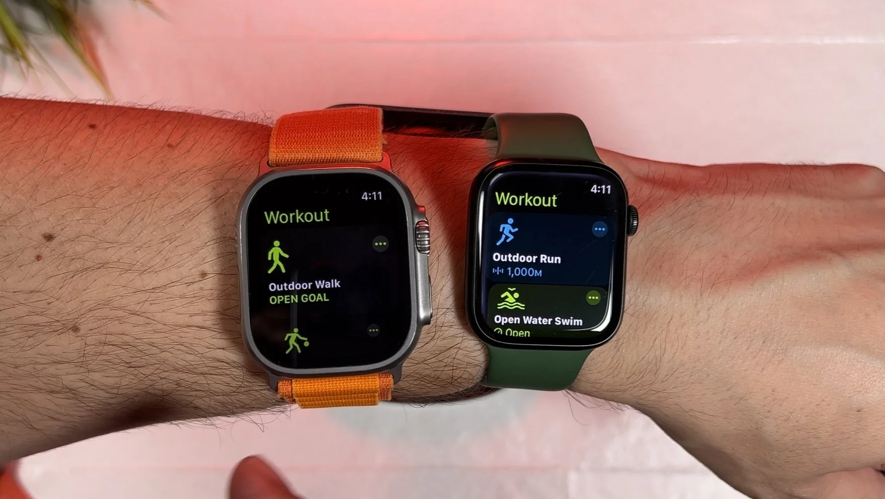
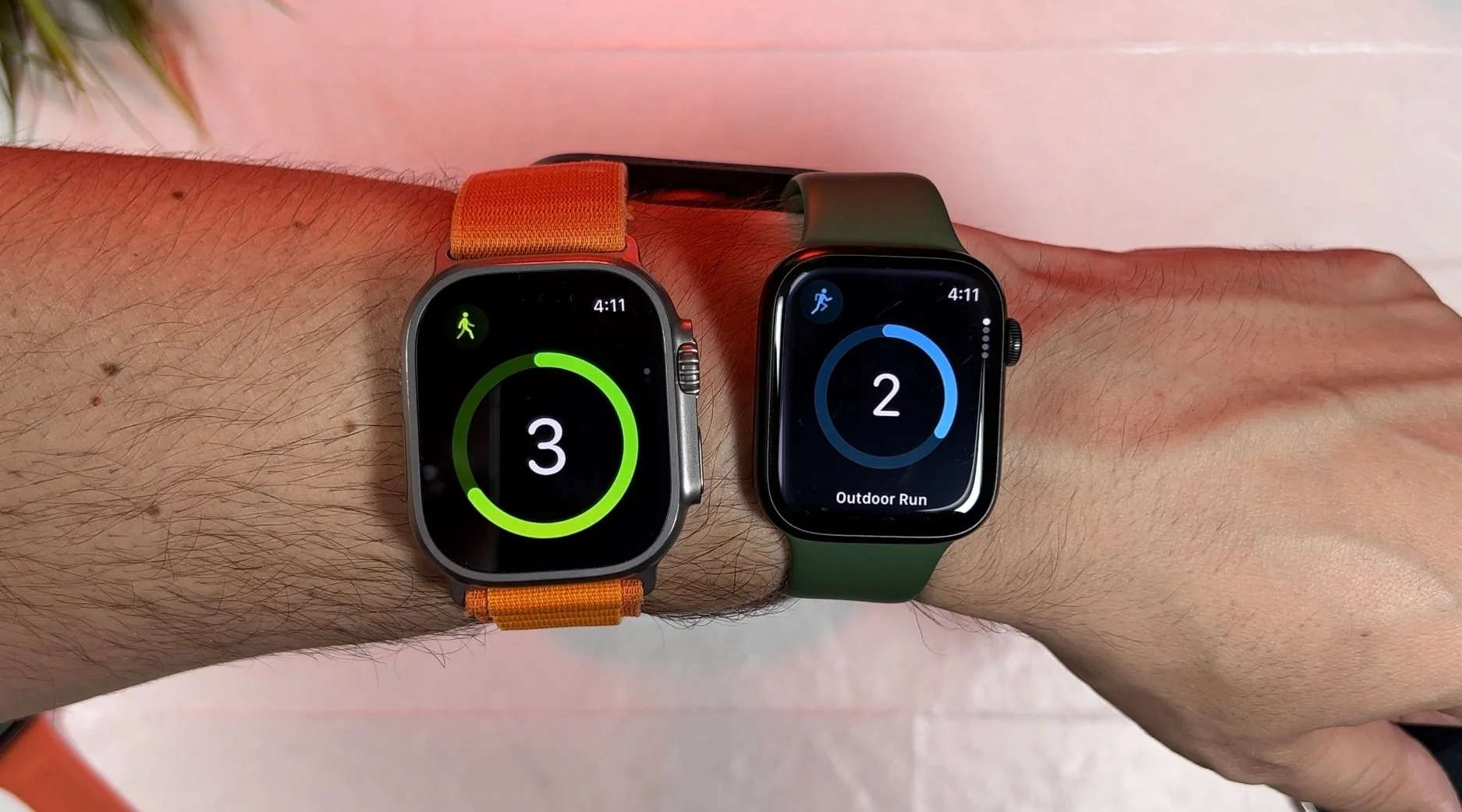
Workout
The Workout application in watchOS 10 has received minor visual updates, incorporating smaller-scale modifications to enhance the user experience. Notably, cycling has emerged as a prominent workout activity in watchOS 10, as Apple has dedicated significant effort to introduce several cycling-specific features for all Apple Watches running this operating system version:
Automatic Workout reminders, calorimetry for e-biking, and Fall Detection are among the existing features for cyclists.
Advanced new metrics, Workout Views, and Bluetooth connectivity for power meters, speed sensors, and cadence sensors are introduced in watchOS 10.
Workout Views optimized for iPhone display provide comprehensive data, including heart rate zones, elevation, race route, custom workouts, and cycling speed.
Apple Watch can now connect to Bluetooth-enabled cycling accessories, enabling new metrics such as cycling power (watts) and cadence (RPM), and additional Workout Views.
New algorithms estimate Functional Threshold Power (FTP) and calculate personalized Power Zones to improve performance.

Music & Now Playing
Apple's Music application in watchOS 10 aims to visually captivate users with its vibrant images and animations, providing an enhanced and enjoyable experience. Notably, the Now Playing section of Apple Music and consequently the Now Playing watch app, offer a visually appealing interface where the album art of the current song takes center stage on the Apple Watch display. This cohesive design approach aligns the Music app on Apple Watch more closely with its counterpart on the iPhone, creating a unified user experience across devices. The same applies for the Listen Now menu, which is also enriched with media, further enhancing the overall visual experience.
The Now Playing application offers the same experience with more types of content playing through any streaming or media playing application.
Music in watchOS 9 (left) vs watchOS 10 (right)
Podcasts
Podcasts in watchOS 10 adopts a similar approach to the Music application, delivering an immersive experience for users. The Listen Now menu showcases podcast cover images more prominently, enhancing the visual appeal. It's worth noting that the new app does not feature the vertical cover flow-like animation when navigating between shows, which was present in previous versions. Nevertheless, the Now Playing menu is exceptionally captivating, offering a stunning visual representation of the current podcast episode.
Podcasts in watchOS 9 (left) vs watchOS 10 (right)
Sleep
The new Sleep application in watchOS 10 embraces the fresh design language adopted by Apple for its first-party applications. However, Apple has gone a step further and introduced some more fundamental functional changes as well. On the landing screen of the Sleep app, you'll now find detailed information about your Sleep Stages, replacing the previous display of the next Sleep Schedule. The Sleep Schedule feature has been moved three screens ahead and can be accessed by rotating the Digital Crown or simply swiping up on the display. In addition to Sleep Stages and Sleep Schedule, Apple has incorporated two additional screens—one for Time Asleep and another for displaying data from the Last 14 Days—in a visually appealing graph format, as seen in the watchOS 9 version as well.
Sleep in watchOS 9 (left) vs watchOS 10 (right)
Alarm, Stopwatch & Timers
Alarm, Stopwatch & Timers offer a more immersive experience as well with larger shapes and graphs taking over the display. Alarm and Timers maintain the “old-fashioned” look with the black main background layered with text and basic graphs while navigating the app menus. However, when a timers goes off a full color screen appears. On the contrary, stopwatch is completely redesigned with Light Mode version of the app debuting in watchOS 10 which replaced the former Dark Mode app.
In watchOS 10, the Alarm, Stopwatch, and Timers apps have undergone enhancements to provide users with a new experience. These apps now feature larger shapes and graphs that occupy a larger part of the display than before, creating an interface paired better with the new design adopted by Apple in the next iteration of watchOS. Alarm and Timers maintain their classic "old-fashioned" aesthetic, with a black main background layered with text and basic graphs as you navigate through the app menus. However, when a timer goes off, a vibrant full-color screen takes over. On the other hand, the Stopwatch app has undergone a complete redesign, introducing a Light Mode version that replaces the previous Dark Mode app. This redesign adds a fresh and modern touch to the stopwatch functionality in watchOS 10. Undoubtedly, this will dissatisfy several users who have a strong preference towards Dark Mode.


Stocks
In watchOS 10, the Stocks app introduces a streamlined approach to accessing stock information. Instead of opening a list with all the stocks in your portfolio, the app now presents a full-screen card displaying detailed information about your first selected stock. By swiping up or down, or using the Digital Crown, you can navigate to view the details of the next stock in your list. Furthermore, you have the flexibility to choose the desired performance time period for each selected stock, ranging from one day to a full year. Additionally, you can easily access the list with your complete portfolio from any of these full-screen displays. This cohesive design language, reminiscent of iOS, has been thoughtfully adapted to perfectly fit the screen size of your Apple Watch in watchOS 10.
Stocks in watchOS 9 (left) vs watchOS 10 (right)
Home
Opening the Home application on your Apple Watch with watchOS 10 will feel like a familiar experience. However, it's not because it looks similar to the Home app you've been using on your watch before. The reason is that it now bears a striking resemblance to the app you've been using on your iPhone for years. Apple has once again redesigned this application, incorporating the aesthetics of the iPhone app. One notable difference is the relocation of Scenes, which have been moved outside your Home. This means that you need to tap and navigate to a top layer menu to access your Home scenes.
Home in watchOS 9 (left) vs watchOS 10 (right)
Voice Memos
Voice Memos on watchOS 10 retains a familiar look and feel from watchOS 9. While there aren't significant changes to the overall experience, one notable difference is the addition of a volume gauge that displays the intensity of your voice during recording. Apart from this feature, Voice Memos maintains the Dark Mode aesthetic introduced in watchOS 9, ensuring a consistent visual experience across your Apple Watch.
Voice Memos in watchOS 9 (left) vs watchOS 10 (right)
Maps
Maps has also been redesigned by Apple watchOS 10. Now, viewing directions on your Apple Watch is a joy as it displays a miniaturized version of a map, offering more than just signs and shapes on a black background. While you can still opt for this familiar view in Maps on watchOS 10 as well, the black background has been replaced with the transparent aesthetics familiar from iOS. Additionally, Maps loads significantly faster in watchOS 10, which is a welcome improvement. Maps on watchOS 10 allows you to search for nearby charging stations for your electric vehicle similarly to iOS 17; however, you cannot search within your offline maps stored in the iOS 17 app directly on your Apple Watch. At least that’s not possible in the first developer beta.
Overall, Maps looks better than ever, although there are some battery concerns. Since Maps remains always on when receiving directions and the OLED-friendly black background has been replaced with a new immersive graphical experience, it is expected to consume more battery life.
Noise
Noise has also received the watchOS 10 treatment from a visual standpoint and follows the design language showcased in the Stocks and Weather applications mentioned above. While the new Noise app doesn't offer any new information, the main difference lies in its updated visual appearance in watchOS 10.
Conclusion & Thoughts
Apple has delivered a remarkable visual experience for Apple Watch users with watchOS 10. By redesigning most of its first-party applications and adding new features at the OS level, watchOS 10 offers a familiar app experience similar to our iPhones. The new version of watchOS introduces miniaturized versions of iPhone apps, indicating a shift toward a standalone experience that relies less on an iPhone. This promises to change the user experience visually in the near future, enhancing the Apple Watch's autonomy and functionality.
Apple Watches are delivering high-quality applications that offer visually rich content, a wide range of features, and notifications while remaining highly efficient for the type of content delivered. The use of plain black background images in most apps, combined with the OLED display of the Apple Watch, contributes to its efficiency. However, the significant visual shift from plain black backgrounds to the new immersive experience in most first-party applications could potentially impact battery life starting from watchOS 10. It is important to note that the battery life experienced in the first developer beta versions may not accurately represent the final performance of the public release. At 9TechEleven, we will keep you updated throughout the beta upgrade cycles leading up to the official launch of watchOS 10 in September.
What else would you like to see covered about watchOS 10? Let us know in the comment section down below.

